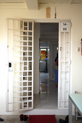
Upon entrance, the existing flooring in the living, dining and all the rooms are the same - white 600x600 white tiles, although it has lost its shine due to wear and tear. The household shelter has been concealed as shown in the photo below with a built out wall.
Above: view from living towards main entrance - door, built up open shelving(looks like some alter of some sort), household shelter door and far right is the entrance to the kitchen. The owner have cleared many of the furniture and most of her items are already packed in boxes in the study area.
Above: Kitchen entrance (left), red feature wall, I'm thinking this must be the dining area with the 2 pendant lights and far right is the living area where the owner has done away with the balcony area and expanded the living.
View of kitchen area: There's alot of afternoon sun coming in here, the film on the windows have all been sunburnt to brown and crispy like keropok!
The kitchen looks quite clean and spacious. But notice, there's no upper cabinets. So that will make the space look bigger. Bottom cabinets are in black laminate with stainless steel countertop and backsplash. But lots of heavy scratches at the condiment area, closer look on the piping, lots of grease, but there's because there's no hood here too. Huge box up that protrudes all the way out of the kitchen cabinet too with big bulkhead above. Flying beam across too, actually after the beam is the service yard area where the owner has expanded the kitchen outwards.
Above: Household shelter blue tiles and paint peeling door frame. I say save the money and not do anything here but a good chemical clean might do the trick.Above: More kitchen photos which shows the large box up at ceiling/beam area, notice there's a curtain in the kitchen being tied up? Yup, it can get really hot that the owner needs the film and curtain! Small 300x300 tiles in the kitchen. Well maintained.
Above: closer look on the ceiling box up. Instant water heater, quite like a pantry!
Entrance of the kitchen area - normal 300x300 white tiles for floor and wall. Quite retro huh this photo! Next is the crispy film i was talking about on the window. It's cracking up already.
Windows and grilles looks really new here, J (our client) would really love white windows and she specifically told us that she wants the grilles removed to have a more open feel. This I totally agree with her. As J loves to bake and is a stay home mum as I mentioned in my earlier post, she really wants something personal for her new kitchen. Although it looks like a waste to hack all the kitchen cabinets but the current colour(black) is really something that she does not want, plus she wants more storage like having upper cabinets.
Above: curtain and crispy film window. The huge box up, totally filled with pipes inside. For the current design, we are also proposing to box up these pipes and hope to flush the kitchen counter.
Above: Flooring of kitchen leading into the common bathroom
Above: Current condition of common bathroom. I think we need to do something here.Above: study area with orange wall (abit of patch paint here). My guess is moisture. The study wall has been hacked and shifted in to allow a bigger room on the other side. J wants to have her dining area here in future, so we got to shift this wall. The window in the study area also faces the common corridor, something which J is not very comfortable with in terms of overlooking and security. So for this room, the grilles are here to stay!
With the removal and relocating a new wall, the floor tiles would be difficult to patch back, so might be easier to just hack off and redo new floor tiles. J is also looking into off-white flooring in lieu to the white floor tiles.
Above: Bedroom 2. Using roller blinds here, so the owner have rolled it all the way up and allowed lots of daylight coming in here. There are 2 single beds here with a white wardrobe here.
 |
| ceiling of bedroom 2. Aircon has to be replaced. very old now. Retro round mirror. |
It might appear to some, maybe the male gender? But it's not the "comfy" or "homey" feel of a bathroom for a sweet lady like J.
When I look at J, I think of Cath Kidston actually. Or maybe in the line of Martha Stewart's home cook recipe books and handicrafts, the kind of home when you step in, it's "soft" and "warm".
Black can be quite an exposing colour to use, especially when it's used for every nook and cranny in a room.
The owner has knocked down a wall to expand the master room into a wardrobe space and study area for themselves. J wants to have the wall back and have this area for her daughter who would really love to have a room to herself.


No comments:
Post a Comment